One Designer, Two Platforms, One Acquisition

One Designer, Two Platforms, One Acquisition

When Qlik acquired Talend in 2024, I was the only designer who knew the learning platform. That continuity was either an asset or a liability depending on what I did with it. I chose to treat the acquisition as a forcing function: redesign the entire learner experience around the constraints that already existed, rather than advocate for a rebuild that would never get prioritized. 1.5M modules completed. $550K in program bookings. +11.3% engagement against a 10% target.

When Qlik acquired Talend in 2024, I was the only designer who knew the learning platform. That continuity was either an asset or a liability depending on what I did with it. I chose to treat the acquisition as a forcing function: redesign the entire learner experience around the constraints that already existed, rather than advocate for a rebuild that would never get prioritized. 1.5M modules completed. $550K in program bookings. +11.3% engagement against a 10% target.

Role

LEAD PRODUCT DESIGNER

(SOLE DESIGNER, PRE & POST ACQUISITION)

LEAD PRODUCT DESIGNER

(SOLE DESIGNER, PRE & POST ACQUISITION)

Timeline

8 Months

COMPANY

Talend → Qlik (Acquisition)

SCOPE

LOGGED-OUT HOMEPAGE · ONBOARDING EXPERIENCE · COURSE CATALOG · FULL PLATFORM CONTINUITY THROUGH ACQUISITION

Collaborators

PRINCIPAL INSTRUCTIONAL DESIGNER · SENIOR LEARNING PROJECTS MANAGER · DIRECTOR OF LEARNING PLATFORMS · DIRECTOR OF ENABLEMENT & CERTIFICATION · DEVOPS ENGINEER · INTELLUM (CSM)

Tools

Figma · Figma make · LOVABLE · Codia · Adobe Illustrator · Miro

IMPACt

1.5M modules completed (↑from 840K YoY) ·

+11.3% increase in learner engagement ·
$550K program bookings ·

96% academic program growth

+11.3% increase in learner engagement · 1.5M modules completed (↑from 840K YoY) · $550K program bookings · 96% academic program growth

+11.3% increase in learner engagement ·
1.5M modules completed (↑from 840K YoY) ·
$550K program bookings ·
96% academic program growth

KEY DECISION

CHOSE TO REDESIGN AROUND THE EXISTING LMS RATHER THAN ADVOCATE FOR A REBUILD. NO COMPARABLE PRECEDENT EXISTEd. OTHER INTELLUM CUSTOMERS WEREN'T BUILDING AN ADAPTIVE LEARNER EXPERIENCE. WE WERE DOING SOMETHING THAT HADN'T BEEN DONE ON THIS PLATFORM BEFORE.

+11.3% increase in learner engagement · 1.5M modules completed (↑from 840K YoY) · $550K program bookings · 96% academic program growth

CHOSE TO REDESIGN AROUND THE EXISTING LMS RATHER THAN ADVOCATE FOR A REBUILD. NO COMPARABLE PRECEDENT EXISTEd. OTHER INTELLUM CUSTOMERS WEREN'T BUILDING AN ADAPTIVE LEARNER EXPERIENCE. WE WERE DOING SOMETHING THAT HADN'T BEEN DONE ON THIS PLATFORM BEFORE.

These outcomes came from designing the right system within constraints that already existed, not from more resources or a platform rebuild.

These outcomes came from designing the right system within constraints that already existed, not from more resources or a platform rebuild.

1.5M

1.5M

modules completed

(↑ from 840K year over year)

Improved discovery and clearer learning paths increased module visibility and completion at scale.

modules completed

(↑ from 840K year over year)

Improved discovery and clearer learning paths increased module visibility and completion at scale.

+11.3%

+11.3%

increase in learner engagement

(target +10%)

Reduced bounce on the logged-out homepage and increased entry into certifications and learning paths.

$550k

$550k

program bookings

Exceeded $500K target, driven by increased certification enrollment.

3.5k

3.5k

certifications completed

Surpassed 3K target through improved progression clarity.

96%

96%

academic program growth

Exceeded 95% target as structured paths increased program visibility.

20H

20H

hands-on cloud training

More than doubled the 8-hour target through labs integration.

The Challenge: The Platform Worked. The Experience Didn’t Scale.

The Challenge: The Platform Worked. The Experience Didn’t Scale.

Legacy Talend Academy and early Qlik Learning (pre-redesign). Two platforms, two structures, no shared foundation.

Legacy Talend Academy and early Qlik Learning (pre-redesign). Two platforms, two structures, no shared foundation.

Context

Context

In 2024, Talend was acquired by Qlik, merging two learning ecosystems into a single platform. I had been part of Talend’s learning team since 2021 and continued as the sole designer through the acquisition, carrying product context across both systems. I had institutional knowledge no one else had. The question was whether I'd use it to patch the old system or redesign around what learners actually needed.

In 2024, Talend was acquired by Qlik, merging two learning ecosystems into a single platform. I had been part of Talend’s learning team since 2021 and continued as the sole designer through the acquisition, carrying product context across both systems. I had institutional knowledge no one else had. The question was whether I'd use it to patch the old system or redesign around what learners actually needed.

the real problem

the real problem

The two platforms merged without a shared architecture, leaving navigation inconsistent across the product, discovery driven by system structure rather than learner goals, and no clear entry point for first-time users. Progress tracking was only available in native LMS sections. Custom pages were essentially static. The platform constrained what was possible before design even started

DECISION 01: WORK WITHIN THE LMS, NOT AGAINST IT

DECISION 01: WORK WITHIN THE LMS, NOT AGAINST IT

Platform constraints (Intellum)

Platform constraints (Intellum)

Intellum's templated layouts offered limited customization. Navigation was constrained by LMS architecture, custom pages couldn't inherit progress states, and catalog filtering was restricted by system logic with no native onboarding flows.

WHAT I COULD HAVE DONE

WHAT I COULD HAVE DONE

Pushed engineering to build workarounds for progress tracking on custom pages. Advocated for a platform migration. Designed the ideal experience and handed the constraints problem to someone else.

WHAT I CHOSE AND WHY

WHAT I CHOSE AND WHY

I designed toward where the LMS was reliable, not where I wished it would be. That meant guiding learners into native sections where progress state actually worked. It was a constraint that became a structural principle: every design decision had to function within the system as it existed, not as I wanted it to be.

DECISION 02: LEARNER-LED NAVIGATION OVER PRODUCT STRUCTURE

DECISION 02: LEARNER-LED NAVIGATION OVER PRODUCT STRUCTURE

the decision

the decision

Navigation Variant A organized around LMS product categories. Variant B organized around learner intent. Stakeholders pushed for A because it mapped to how the platform was structured internally. I pushed for B because testing showed learners browsed by topic, not by product. I won that argument with behavior, not opinion. The logged-out homepage was the first thing a prospective learner saw. It needed to do two things: communicate value and guide someone to take action, without overwhelming them with platform complexity.

what i gave up

what i gave up

Variant A would have been easier to maintain as the product catalog grew. Product-forward navigation meant content teams could update it without design involvement. Choosing learner-led navigation meant we took on more IA responsibility long term. That was the right tradeoff.

DECISION 03: ONE HOMEPAGE FOR EVERYONE VS A SYSTEM THAT ADAPTS

DECISION 03: ONE HOMEPAGE FOR EVERYONE VS A SYSTEM THAT ADAPTS

After launch, enrollment went up but engagement dropped. The obvious fix was better discovery. The right fix was progression. I chose to redesign the entire logged-in experience around where a learner was in their journey, not what content was available.

After improving the logged-out homepage, analytics and usability testing

revealed that enrollment increased but learners lacked clarity on next steps.

Progress tracking was unavailable on custom pages, engagement dropped

after initial exploration, and we weren't solving onboarding.

We were solving sustained engagement.


After launch, enrollment went up but engagement dropped. The obvious fix was better discovery. The right fix was progression. I chose to redesign the entire logged-in experience around where a learner was in their journey, not what content was available.

  1. Onboarding (0–10 Days)

  1. Onboarding (0–10 Days)

Reduce anxiety, show first steps, and introduce guided starter content.

  1. Adopt (Momentum Building)

  1. Adopt (Momentum Building)

Reinforce habit and relevance while surfacing personalized next actions.

  1. Discover (Active Learners)

  1. Discover (Active Learners)

Support deeper exploration and clarify paths and progression.

  1. Mastery

  1. Mastery

Align certifications to readiness and signal proof of expertise.

THE INSIGHT THAT CHANGED EVERYTHING

THE INSIGHT THAT CHANGED EVERYTHING

After the logged-out homepage launched, it became clear that solving entry clarity was not enough. The logged-in experience needed to prioritize guidance over available progress states, surface the right next action at the right time, and support learner maturity through structured onboarding, personalization logic, and measurable activation signals.

THE CONSTRAINT THAT SHAPED IT

THE CONSTRAINT THAT SHAPED IT

One key technical limitation of Intellum was that course completion couldn't be surfaced in custom-built sections like the catalog or homepage. Progress was only visible through Intellum's native Continue Learning section. This constraint directly shaped the onboarding strategy. Rather than fighting the platform, we designed the logged-in homepage flows to guide learners toward native sections where progress state was reliable.

WHAT I DEPRIORITIZED

WHAT I DEPRIORITIZED

A single improved homepage would have been faster to ship and easier to maintain. I deprioritized that in favor of a more complex system because the data was clear: generic experiences were failing returning learners. Simple wasn't the right answer here.

HOW I TESTED THE DECISION

HOW I TESTED THE DECISION

To validate direction, I ran 10+ moderated sessions across first-time and returning learners, testing clarity of onboarding and first action, confidence in progression and next steps, understanding of certification pathways, and perceived value within the first five minutes. Findings informed the 10-day onboarding model, modular grouping strategy, and findings directly shaped the 4-stage learner model.

WORKING ACROSS THE ORG

WORKING ACROSS THE ORG

This project touched a principal instructional designer, a senior learning projects manager, two directors, and a DevOps engineer. Getting alignment across that group required more than good design. It required knowing when to push back and when to listen.


The clearest example was early. Our director suggested benchmarking against other Intellum customers, including Pinterest, to inform the navigation approach. I explored how those platforms handled onboarding and logged-in experiences and found a fundamental difference: no one else was building an adaptive learner lifecycle. Their logged-out and logged-in homepages were identical. There was no benchmark to follow. I brought that finding back to the team and it reoriented our approach entirely. We were not behind. We were building something that had not been done on this platform before.


The constraint that shaped the most design decisions was one I escalated rather than designed around. Progress tracking was only available in Intellum's native sections, not on custom pages. Rather than quietly building around it, I flagged it as a structural blocker. That conversation led to escalating directly with Intellum, a new CSM relationship, and active work to incorporate custom page tracking in future launches. A design limitation became a product roadmap item.

After improving the logged-out homepage, analytics and usability testing

revealed that enrollment increased but learners lacked clarity on next steps.

Progress tracking was unavailable on custom pages, engagement dropped

after initial exploration, and we weren't solving onboarding.

We were solving sustained engagement.


This project touched a principal instructional designer, a senior learning projects manager, two directors, and a DevOps engineer. Getting alignment across that group required more than good design. It required knowing when to push back and when to listen.


The clearest example was early. Our director suggested benchmarking against other Intellum customers, including Pinterest, to inform the navigation approach. I explored how those platforms handled onboarding and logged-in experiences and found a fundamental difference: no one else was building an adaptive learner lifecycle. Their logged-out and logged-in homepages were identical. There was no benchmark to follow. I brought that finding back to the team and it reoriented our approach entirely. We were not behind. We were building something that had not been done on this platform before.


The constraint that shaped the most design decisions was one I escalated rather than designed around. Progress tracking was only available in Intellum's native sections, not on custom pages. Rather than quietly building around it, I flagged it as a structural blocker. That conversation led to escalating directly with Intellum, a new CSM relationship, and active work to incorporate custom page tracking in future launches. A design limitation became a product roadmap item.

WHAT CHANGED BECAUSE I WAS IN THE ROOM

WHAT CHANGED BECAUSE I WAS IN THE ROOM

  • Navigation direction shifted from product-forward to learner-led after I presented behavioral testing data

  • Intellum escalation resulted in a new CSM and a feature request now on their roadmap

  • The 4-stage learner model was adopted as the framework for all future logged-in experience decisions

DECISION 04: BUILDING BEYOND WHAT THE LMS ALLOWED

DECISION 04: BUILDING BEYOND WHAT THE LMS ALLOWED

Discovery Was Functionally a Content Dump

Discovery Was Functionally a Content Dump

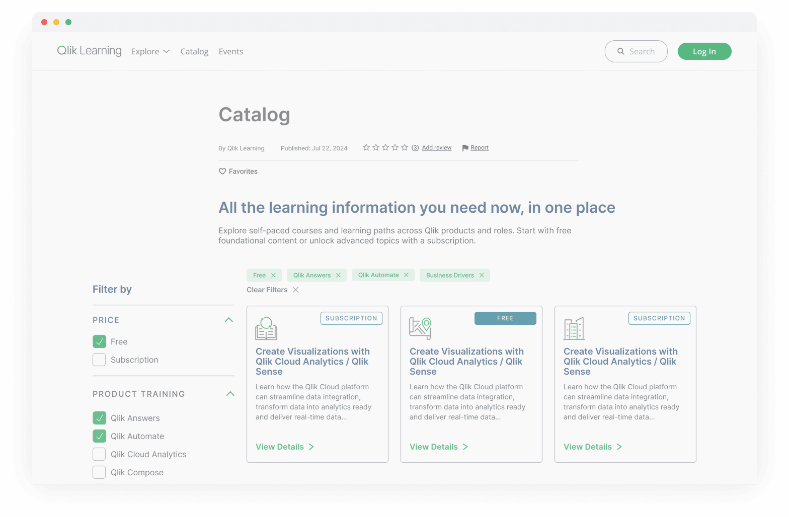
  • No filtering or sorting controls

  • No distinction between free vs subscription content

  • No product-level organization

  • Increasing content volume made discovery progressively harder

SOLUTION

SOLUTION

Rather than accept the native catalog, I built a custom discovery layer in HTML and CSS only, no backend access, no platform rebuild. Structured filtering, product-based grouping, and free vs subscription segmentation, all inside LMS constraints. Every other Intellum customer had accepted the native experience. We didn't.

Business & Adoption Impact

Business & Adoption Impact

These outcomes weren't the result of more resources or a platform rebuild. They came from designing the right system within the constraints that already existed.

These outcomes weren't the result of more resources or a platform rebuild. They came from designing the right system within the constraints that already existed.

These outcomes weren't the result of more resources or a platform rebuild. They came from designing the right system within the constraints that already existed.

1.5M

1.5M

modules completed

(↑ from 840K year over year)

Improved discovery and clearer learning paths increased module visibility and completion at scale.

+11.3%

+11.3%

increase in learner engagement

(target +10%)

Reduced bounce on the logged-out homepage and increased entry into certifications and learning paths.

$550k

$550k

program bookings

Exceeded $500K target, driven by increased certification enrollment.

3.5k

3.5k

certifications completed

Surpassed 3K target through improved progression clarity.

96%

96%

academic program growth

Exceeded 95% target as structured paths increased program visibility.

20H

20H

hands-on cloud training

More than doubled the 8-hour target through labs integration.

These results reflect a shift from isolated UI improvements to a scalable learning system. Designing within LMS constraints improved learner clarity while enabling long-term content growth, without increasing UX or engineering overhead.

These results reflect a shift from isolated UI improvements to a scalable learning system. Designing within LMS constraints improved learner clarity while enabling long-term content growth, without increasing UX or engineering overhead.

EXTENDING THE PLATFORM WITH AI

EXTENDING THE PLATFORM WITH AI

AI ACADEMY: ITERATING FASTER WITH FIGMA MAKE

AI ACADEMY: ITERATING FASTER WITH FIGMA MAKE

The AI Academy needed to feel like a distinct experience within Qlik Learning, not just another page. I had a clear concept but iterating on layout manually was slowing me down. Instead of continuing in Figma the traditional way, I prompted Figma Make with my existing design, the color system, and the logic of the learning path. It took 6 iterations to get to something usable.


What it got right: the content format. The hero with a video placeholder, the left-aligned headline, the course row structure with progress states. It solved the layout faster than I would have manually.


What I changed on top: the journey structure. Figma Make didn't know what data we could actually track yet, so it included progress logic we couldn't support. I stripped that out, restructured the step sequence to reflect what would actually ship, and added a richer background to push the AI Academy aesthetic further away from the standard Qlik Learning pages. The goal was always for this to feel like you had entered a different space.

Initial design, Figma only

Initial design, Figma only

After 6 Figma Make iterations

After 6 Figma Make iterations

Final version after my edits

Final version after my edits

MOBILE LOGGED-OUT PAGE: ADVOCATING FOR THE GAP

MOBILE LOGGED-OUT PAGE: ADVOCATING FOR THE GAP

Mobile was deprioritized at launch because learner data showed no meaningful mobile usage on the platform. I pushed back on one exception: the logged-out page. That surface is not a product page, it is a marketing page. The people seeing it on mobile are prospects, not existing users. First impressions matter regardless of what the internal analytics say. I made the case, then built it myself using AI.

Lovable translated the web layout to mobile in minutes. I brought it into Figma via Codia, swapped in the exact assets, and fixed the hero treatment. The whole process took a fraction of the time it would have taken to design from scratch.

Lovable translated the web layout to mobile in minutes. I brought it into Figma via Codia, swapped in the exact assets, and fixed the hero treatment. The whole process took a fraction of the time it would have taken to design from scratch.

Lovable translated the web layout to mobile in minutes. I brought it into Figma via Codia, swapped in the exact assets, and fixed the hero treatment. The whole process took a fraction of the time it would have taken to design from scratch.

Final Reflection

Final Reflection

This work transformed Qlik Learning from a collection of LMS pages into a scalable learning system. By designing within platform constraints, I created a structure that improved learner clarity while enabling long-term growth without increasing UX or engineering overhead. If given more time, I would have invested in more longitudinal learner research to better understand how users evolve across the 4-stage model over months rather than weeks.

This work transformed Qlik Learning from a collection of LMS pages into a scalable learning system. By designing within platform constraints, I created a structure that improved learner clarity while enabling long-term growth without increasing UX or engineering overhead. If given more time, I would have invested in more longitudinal learner research to better understand how users evolve across the 4-stage model over months rather than weeks.

This work transformed Qlik Learning from a collection of LMS pages into a scalable learning system. By designing within platform constraints, I created a structure that improved learner clarity while enabling long-term growth without increasing UX or engineering overhead. If given more time, I would have invested in more longitudinal learner research to better understand how users evolve across the 4-stage model over months rather than weeks.