
ROLE
Solo Designer/
Researcher
OUTPUT
Live Lovable prototype
+ Figma component library
TYPE
AI Evaluation ·
Mobile UX · Prototyping
TOOLS
ChatGPT · FigJam ·
UX Pilot · Banani ·
Magic Patterns · v0 ·
Lovable · Figma Make ·
Codia · Paper + Cursor
ROLE
Senior Product Designer
COLLABORATORS
Director, 3 Engineers, Content Creator
COMPANY
BigID
TOOLS
Figma, Claude, ChatGPT
SCOPE
Homepage · Catalog · Learning paths · Events · Labs · Certification · Community · Profile
ROLE
Senior Product Designer
COLLABORATORS
Director, 3 Engineers,
Content Creator
COMPANY
BigID
TOOLS
Figma, Claude,
ChatGPT
SCOPE
Homepage · Catalog · Learning paths · Events · Labs · Certification · Community · Profile
Tl;dr
Tl;dr
PROBLEM
Every AI design tool claims to accelerate the workflow. None of them explain where they break down, what they're actually for, or how they fit together. I wanted to know that before recommending them to a team.
CONSTRAINT
One week, solo, no engineering support. Every tool had to be evaluated on what a designer could actually do with it alone.
APPROACH
Same brief, same app, every tool. I redesigned PetPals, a dog meetup app, using 10 different AI tools in sequence, stress-testing each one under identical conditions.
OUTCOME
A live 35-screen prototype, a Figma component library born from real code, and a clear map of when to reach for each tool, and when not to.
PROBLEM
BigID's learning platform had grown by addition, never by design — 11 disconnected surfaces, no clear entry point, invisible progress.
CONSTRAINT
No LMS foundation, 3 months, incremental rollout — couldn't break what was already live for thousands of users.
APPROACH
System-first redesign: unified IA, dual homepage states, reusable card patterns, and a catalog rebuilt around learner intent.
OUTCOME
First time BigID University was designed as a product, not assembled as a tool. Launching May 2026.
Results
Results
The result wasn't just a redesigned app. It was clarity: I now reach for AI tools at specific moments, for specific reasons. That clarity came from watching exactly where each one broke down.
The result wasn't just a redesigned app. It was clarity: I now reach for AI tools at specific moments, for specific reasons. That clarity came from watching exactly where each one broke down.
Phase 1 — Reframing the problem
TOOL 1: CHATGPT · INTERROGATING THE BRIEF BEFORE TOUCHING ANY DESIGN TOOL
TOOL 1: CHATGPT · INTERROGATING THE BRIEF BEFORE TOUCHING ANY DESIGN TOOL
Most designers skip this step entirely. That's a mistake.
Before opening any design tool, I used ChatGPT to interrogate the original PetPals research. Not to generate ideas, but to find what the original design had missed. I pasted user research findings, competitor analysis, and testing notes, then asked it to identify gaps.
What it got right: the brief it surfaced was sharper than the original. Three gaps the original design hadn't fully addressed (trust and safety, real-time coordination, and dog compatibility) became the foundation for every tool that followed. Same input, every time.
What it got wrong: nothing here. ChatGPT is the right tool for this job. The mistake is using it to generate screens instead.
Most designers skip this step entirely. That's a mistake.
Before opening any design tool, I used ChatGPT to interrogate the original PetPals research. Not to generate ideas, but to find what the original design had missed. I pasted user research findings, competitor analysis, and testing notes, then asked it to identify gaps.
What it got right: the brief it surfaced was sharper than the original. Three gaps the original design hadn't fully addressed (trust and safety, real-time coordination, and dog compatibility) became the foundation for every tool that followed. Same input, every time.
What it got wrong: nothing here. ChatGPT is the right tool for this job. The mistake is using it to generate screens instead.
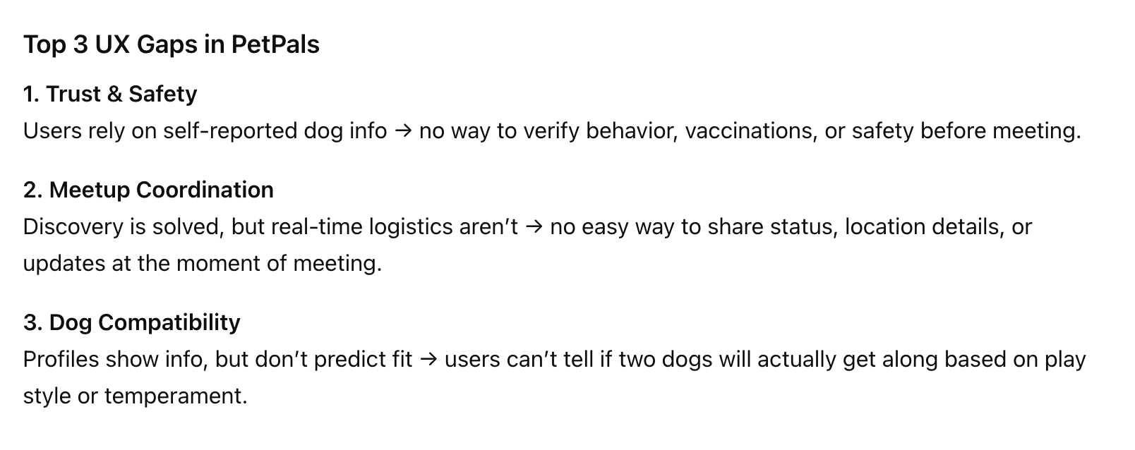
ChatGPT's response to the original PetPals research, surfacing 3 UX gaps the original design hadn't fully addressed.
ChatGPT's response to the original PetPals research, surfacing 3 UX gaps the original design hadn't fully addressed.
Best for: Reframing research, identifying gaps, writing prompts for every tool that follows.
Not for: Anything visual. It describes interfaces; it doesn't generate them.
Best for: Reframing research, identifying gaps, writing prompts for every tool that follows.
Not for: Anything visual. It describes interfaces; it doesn't generate them.
Phase 2 — Mapping the redesign
Phase 2 — Mapping the redesign
TOOL 2: FIGJAM · THE SPATIAL CANVAS CHANGES HOW YOU THINK, NOT JUST HOW YOU PRESENT
TOOL 2: FIGJAM · THE SPATIAL CANVAS CHANGES HOW YOU THINK, NOT JUST HOW YOU PRESENT
With a revised brief, I moved into FigJam to map the redesign before touching any screens. I used ChatGPT to generate the content: a 9-step user journey, revised IA, 8 pain points, and 6 feature ideas. Then I organized everything spatially on the board.
What it got right: FigJam's native AI automatically grouped the pain points into 4 themes and generated a summary card. The spatial canvas forced structural decisions that a list or document never would. User journey, IA, pain points, and feature ideas were all visible at once. That simultaneity changed how I thought about the system.
What it got wrong: FigJam and ChatGPT don't connect natively. Every piece of content had to be manually copied across. The sequence matters as much as the tools. They don't know about each other.
With a revised brief, I moved into FigJam to map the redesign before touching any screens. I used ChatGPT to generate the content: a 9-step user journey, revised IA, 8 pain points, and 6 feature ideas. Then I organized everything spatially on the board.
What it got right: FigJam's native AI automatically grouped the pain points into 4 themes and generated a summary card. The spatial canvas forced structural decisions that a list or document never would. User journey, IA, pain points, and feature ideas were all visible at once. That simultaneity changed how I thought about the system.
What it got wrong: FigJam and ChatGPT don't connect natively. Every piece of content had to be manually copied across. The sequence matters as much as the tools. They don't know about each other.
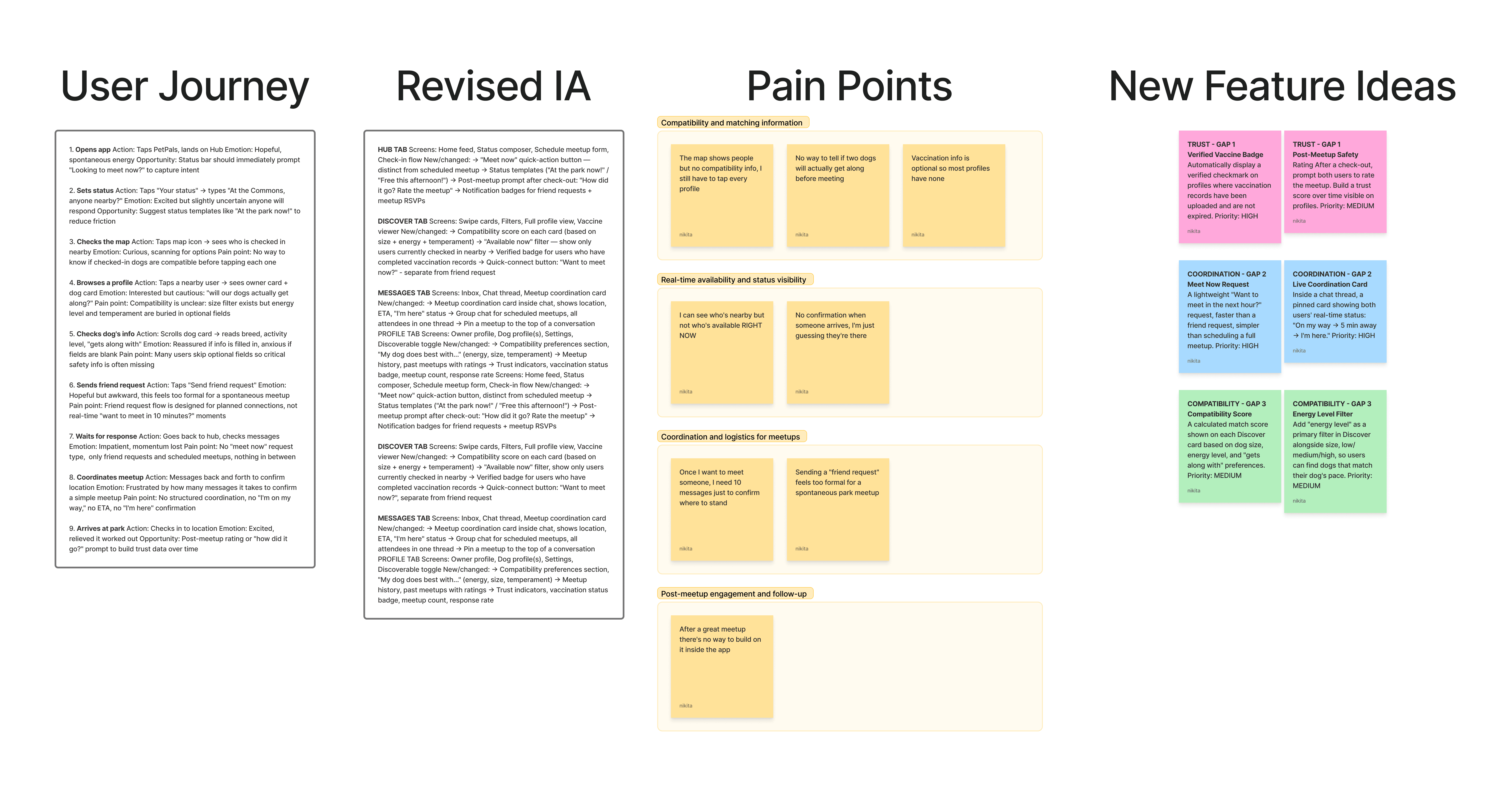
FigJam board populated with ChatGPT-generated content. FigJam's native AI automatically grouped the pain points into 4 themes and generated the summary card on the left.
FigJam board populated with ChatGPT-generated content. FigJam's native AI automatically grouped the pain points into 4 themes and generated the summary card on the left.
Best for: Structural thinking, synthesizing AI-generated content spatially, stakeholder alignment.
Not for: Generating screens or moving directly into visual design.
Best for: Structural thinking, synthesizing AI-generated content spatially, stakeholder alignment.
Not for: Generating screens or moving directly into visual design.
Phase 3 — Generating screens
Phase 3 — Generating screens
TOOL 3: UX PILOT · SINGLE-SCREEN GENERATION INSIDE YOUR EXISTING FIGMA WORKFLOW
TOOL 3: UX PILOT · SINGLE-SCREEN GENERATION INSIDE YOUR EXISTING FIGMA WORKFLOW
UX Pilot lives inside Figma as a plugin. You describe a screen and it generates hi-fi UI directly onto your canvas. I ran 3 rounds. Rounds 1 and 2 produced 3 variations of the same screen rather than 3 distinct screens. The problem: the tool defaulted to interpreting "3 screens" as "3 versions of one screen." Round 3 used one prompt per screen and the outputs were immediately better.
What it got right: fast hi-fi generation inside an existing Figma workflow. When prompted correctly, it produced usable starting points.
What it got wrong: multi-screen prompts require more careful structuring with one prompt per screen is the rule, not a preference. One screen per prompt is the rule, not a preference. Anything generated here stays in the design phase. There is no path to code without a separate tool.
UX Pilot lives inside Figma as a plugin. You describe a screen and it generates hi-fi UI directly onto your canvas. I ran 3 rounds. Rounds 1 and 2 produced 3 variations of the same screen rather than 3 distinct screens. The problem: the tool defaulted to interpreting "3 screens" as "3 versions of one screen." Round 3 used one prompt per screen and the outputs were immediately better.
What it got right: fast hi-fi generation inside an existing Figma workflow. When prompted correctly, it produced usable starting points.
What it got wrong: multi-screen prompts require more careful structuring with one prompt per screen is the rule, not a preference. One screen per prompt is the rule, not a preference. Anything generated here stays in the design phase. There is no path to code without a separate tool.
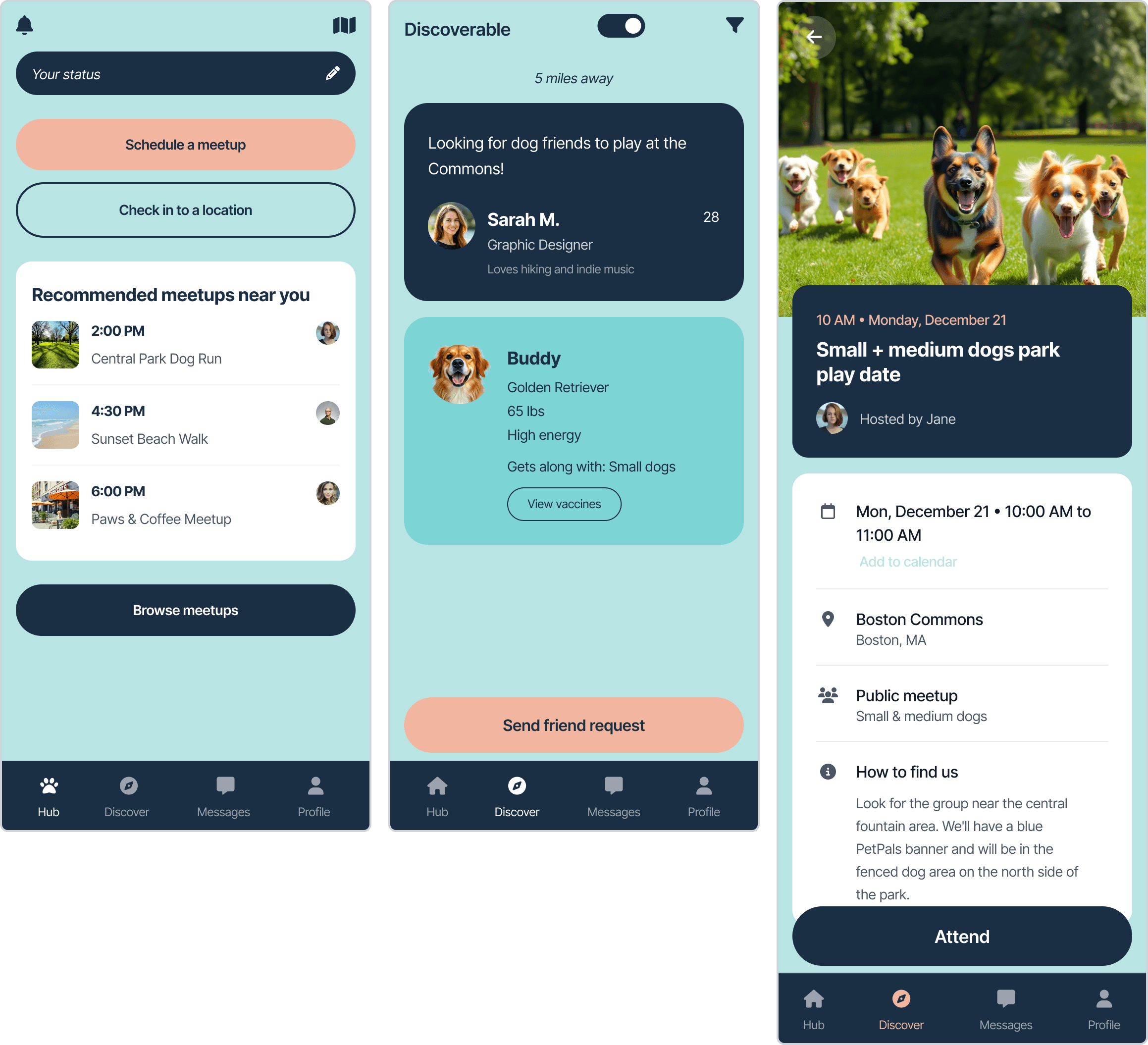
Round 3: 3 distinct screens using one prompt each.
Round 3: 3 distinct screens using one prompt each.
Best for: Single screen exploration inside an existing Figma workflow.
Not for: Multi-screen flows, code export, or starting from scratch without a design direction.
Best for: Single screen exploration inside an existing Figma workflow.
Not for: Multi-screen flows, code export, or starting from scratch without a design direction.
TOOL 4: BANANI · THE FASTEST WAY TO EXPLORE A LAYOUT DIRECTION YOU'RE NOT SURE ABOUT YET
TOOL 4: BANANI · THE FASTEST WAY TO EXPLORE A LAYOUT DIRECTION YOU'RE NOT SURE ABOUT YET
Banani applied the one-screen-per-prompt rule from the start and added image reference support. Attaching the original hi-fi screens alongside the prompt gave Banani a visual anchor that hex codes alone couldn't provide. Color accuracy improved noticeably. The dual owner and dog card layout on Discover was understood immediately without needing multiple rounds. The form screen was the strongest output: all fields present, correct layout hierarchy, clean minimal styling.
What it got right: image references dramatically improve accuracy. The tool understood visual intent that text descriptions alone couldn't convey.
What it got wrong: like UX Pilot, everything stays in the design phase. Output is HTML/CSS, not a connected prototype someone can navigate.
Banani applied the one-screen-per-prompt rule from the start and added image reference support. Attaching the original hi-fi screens alongside the prompt gave Banani a visual anchor that hex codes alone couldn't provide. Color accuracy improved noticeably. The dual owner and dog card layout on Discover was understood immediately without needing multiple rounds. The form screen was the strongest output: all fields present, correct layout hierarchy, clean minimal styling.
What it got right: image references dramatically improve accuracy. The tool understood visual intent that text descriptions alone couldn't convey.
What it got wrong: like UX Pilot, everything stays in the design phase. Output is HTML/CSS, not a connected prototype someone can navigate.
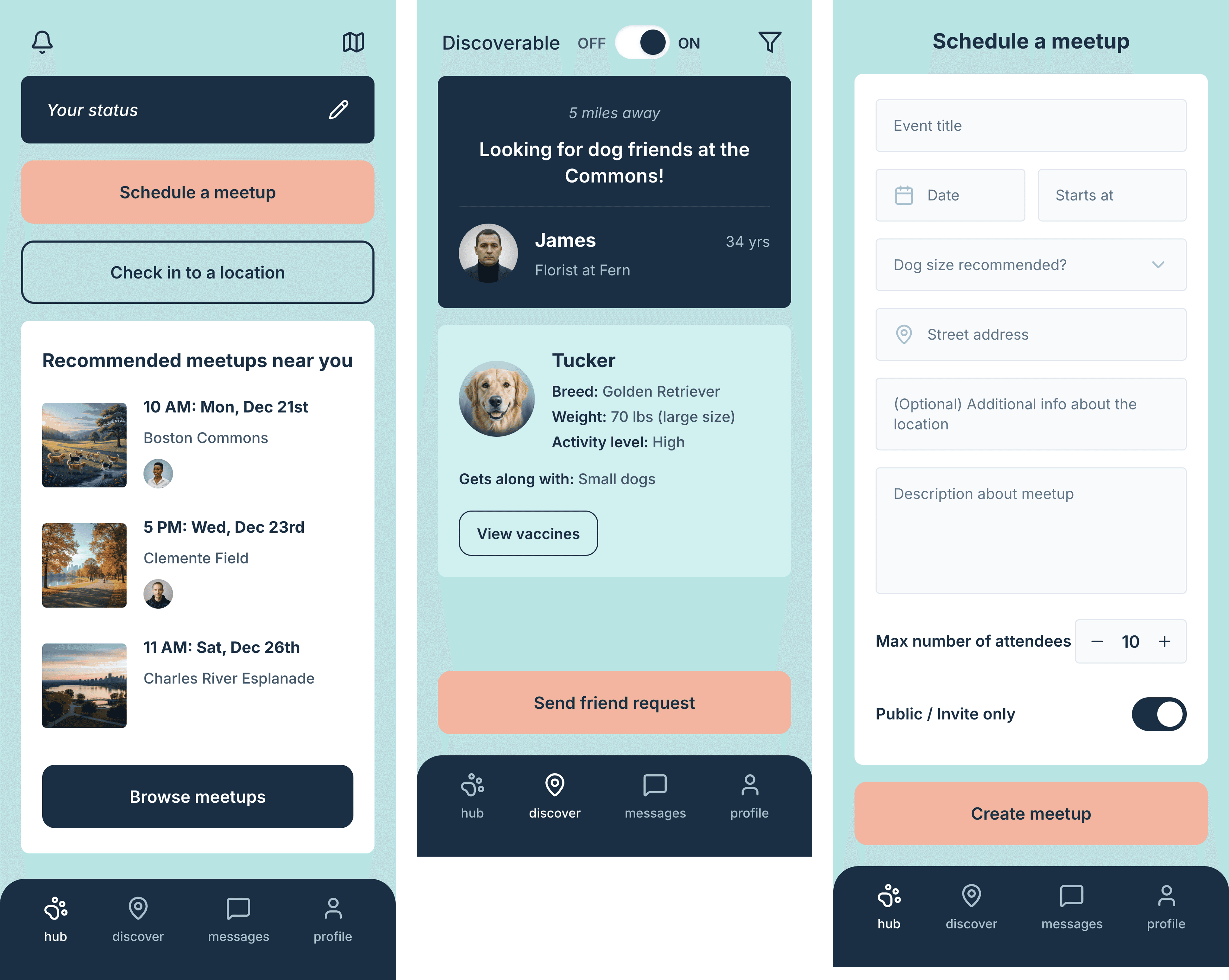
Hub, Discover, and Schedule Meetup form, all generated on first attempt with image references attached.
Hub, Discover, and Schedule Meetup form, all generated on first attempt with image references attached.
Best for: Multi-screen lo-fi flows when you already have a visual direction. Strongest early in the process when you need to explore layout fast before committing.
Not for: Later-stage work where brand precision and component consistency matter.
Best for: Multi-screen lo-fi flows when you already have a visual direction. Strongest early in the process when you need to explore layout fast before committing.
Not for: Later-stage work where brand precision and component consistency matter.
Phase 4 — From wireframes to code
Phase 4 — From wireframes to code
TOOL 5: MAGIC PATTERNS · THE ONLY SCREEN GENERATOR THAT RESPECTS YOUR EXISTING DESIGN SYSTEM
TOOL 5: MAGIC PATTERNS · THE ONLY SCREEN GENERATOR THAT RESPECTS YOUR EXISTING DESIGN SYSTEM
Magic Patterns generates production-ready React and Tailwind components, not screen images. When I prompted the Hub screen, it first read the existing DiscoverScreen.tsx before writing new code. It maintained design system consistency across all three screens sharing the same design tokens, component names, and visual logic.
What it got right: architectural awareness. It reads existing code before generating new code. The gap between a screenshot and a deployable component is enormous in practice. Magic Patterns closes most of it.
What it got wrong: it requires a developer-ready codebase to shine. Without an existing design system to import, it defaults to Shadcn and Tailwind patterns, which are clean but generic. Not the right tool for early exploration.
Magic Patterns generates production-ready React and Tailwind components, not screen images. When I prompted the Hub screen, it first read the existing DiscoverScreen.tsx before writing new code. It maintained design system consistency across all three screens sharing the same design tokens, component names, and visual logic.
What it got right: architectural awareness. It reads existing code before generating new code. The gap between a screenshot and a deployable component is enormous in practice. Magic Patterns closes most of it.
What it got wrong: it requires a developer-ready codebase to shine. Without an existing design system to import, it defaults to Shadcn and Tailwind patterns, which are clean but generic. Not the right tool for early exploration.
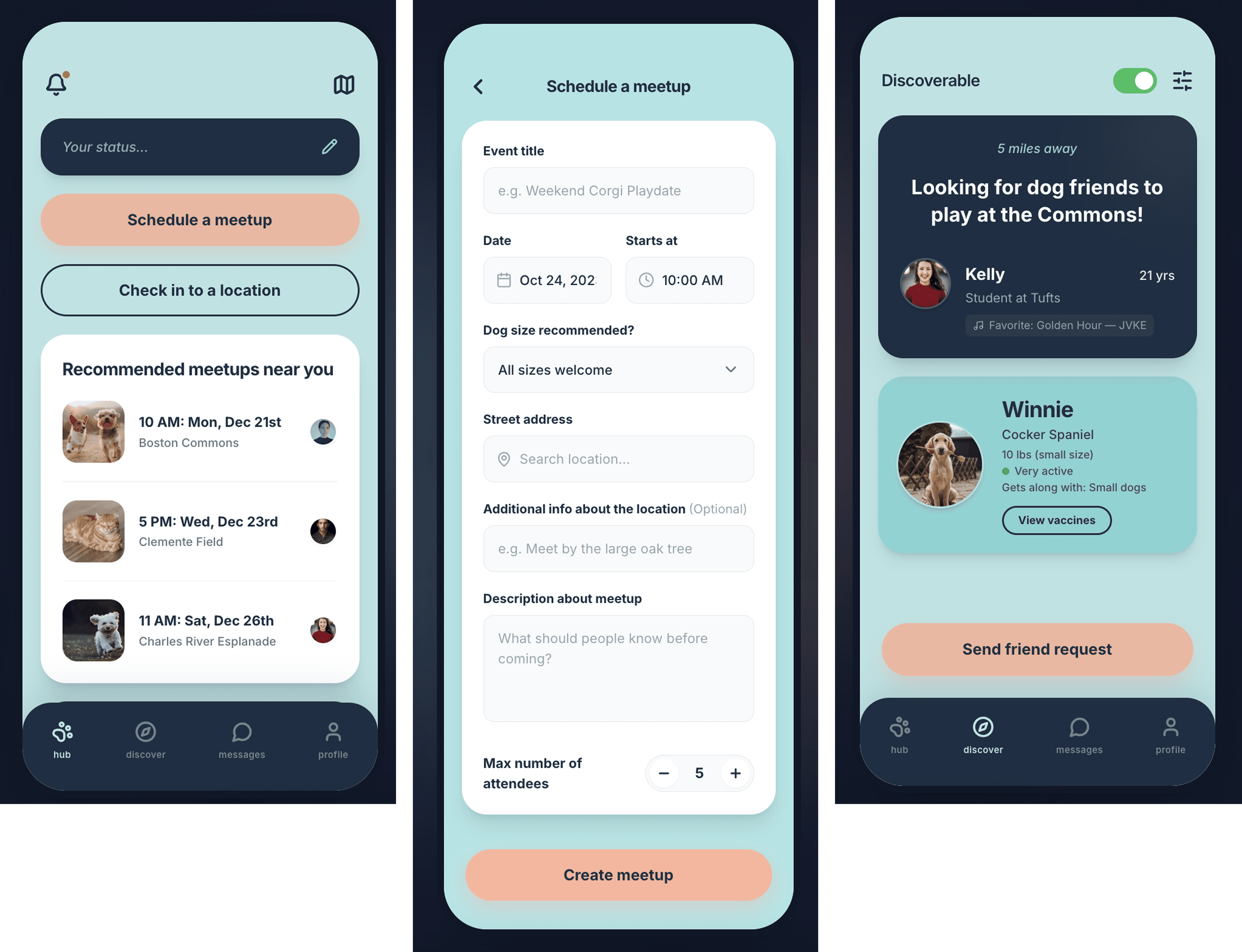
Magic Patterns generated structured React components that share a codebase, reading existing files before writing new ones.
Magic Patterns generated structured React components that share a codebase, reading existing files before writing new ones.
Best for: Working closely with a development team where design system consistency matters. Code quality is high enough for a developer to use directly.
Not for: Starting from scratch, solo design exploration, or teams without an established component library.
Best for: Working closely with a development team where design system consistency matters. Code quality is high enough for a developer to use directly.
Not for: Starting from scratch, solo design exploration, or teams without an established component library.
TOOL 6: V0 BY VERCEL · IMPRESSIVE SPEED, FORGETTABLE OUTPUT. RIGHT TOOL FOR THE WRONG REASONS MOST OF THE TIME
TOOL 6: V0 BY VERCEL · IMPRESSIVE SPEED, FORGETTABLE OUTPUT. RIGHT TOOL FOR THE WRONG REASONS MOST OF THE TIME
v0 generated all 3 screens in one conversation using React and Tailwind, then deployed them to a live URL in minutes. From prompt to live deployed URL in one session.
What it got right: speed and shareability. Going from a prompt to something a stakeholder can tap on a phone is genuinely significant. One-click Vercel deployment is a real differentiator.
What it got wrong: v0 doesn't know your design system. It defaults to its own component library, which is clean, generic, and forgettable. Brand decisions that make a product feel like a real product don't transfer from a text description alone. The output looked like every other v0 project.
v0 generated all 3 screens in one conversation using React and Tailwind, then deployed them to a live URL in minutes. From prompt to live deployed URL in one session.
What it got right: speed and shareability. Going from a prompt to something a stakeholder can tap on a phone is genuinely significant. One-click Vercel deployment is a real differentiator.
What it got wrong: v0 doesn't know your design system. It defaults to its own component library, which is clean, generic, and forgettable. Brand decisions that make a product feel like a real product don't transfer from a text description alone. The output looked like every other v0 project.
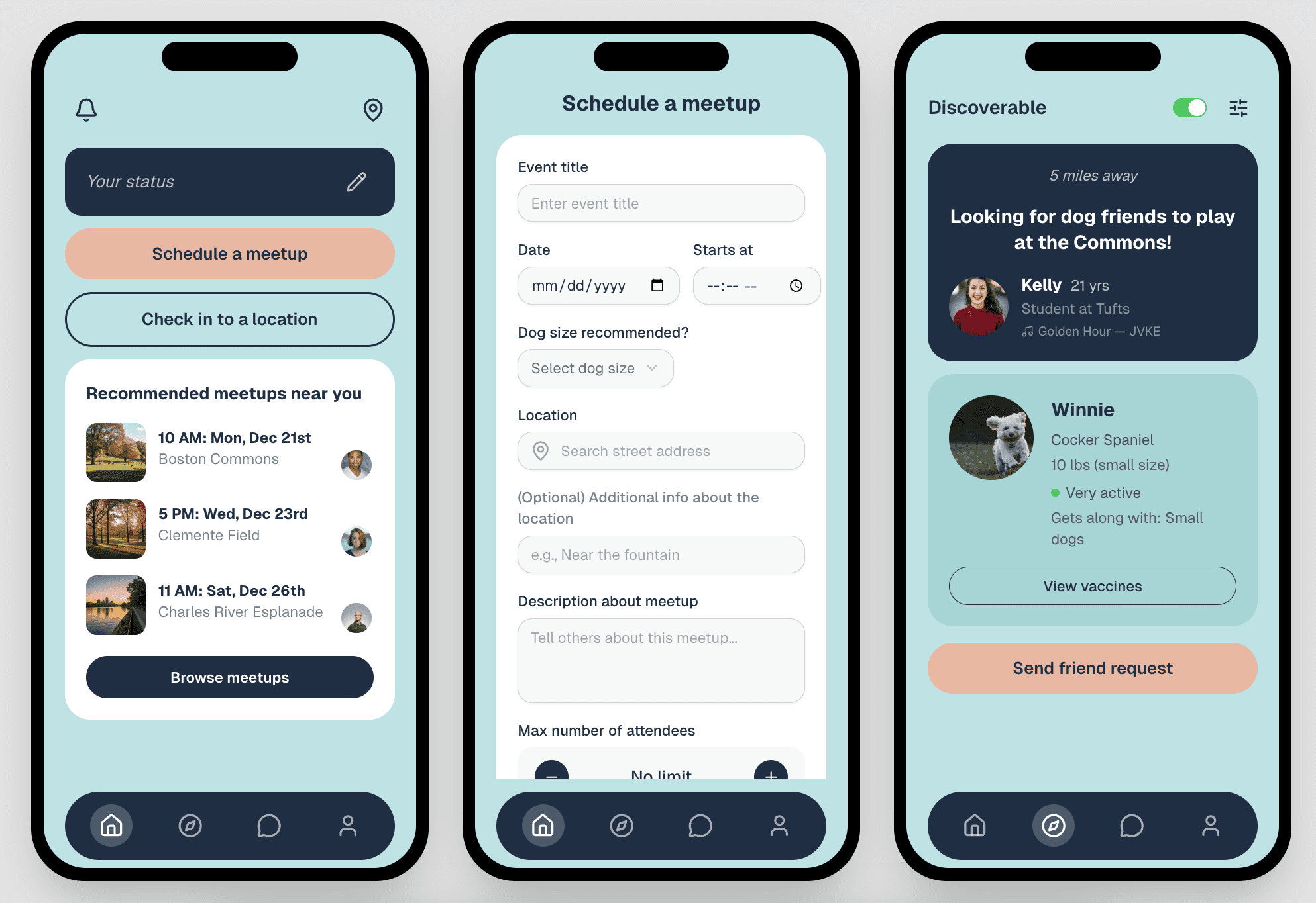
From prompt to live deployed URL in one session.
From prompt to live deployed URL in one session.
Best for: Stakeholder demos and developer handoff. Fast path from prompt to something shareable.
Not for: Brand-specific work, design system fidelity, or anything where the output needs to feel like your product.
Best for: Stakeholder demos and developer handoff. Fast path from prompt to something shareable.
Not for: Brand-specific work, design system fidelity, or anything where the output needs to feel like your product.
TOOL 7: LOVABLE · NOTHING ELSE COMES CLOSE FOR GETTING SOMETHING INTO A USER'S HANDS FAST
TOOL 7: LOVABLE · NOTHING ELSE COMES CLOSE FOR GETTING SOMETHING INTO A USER'S HANDS FAST
Lovable was the only tool in the experiment that produced something you could hand to a real user and say "try it." All 6 screens navigated correctly. Tapping "Schedule a meetup" went to the form. Tapping a meetup opened the detail view. The messages tab opened individual chat threads.
What it got right: the gap between a screenshot and a working prototype is enormous in practice. Lovable is the only tool that closes it. For user testing, stakeholder reviews, and any situation where someone needs to actually interact with the design rather than look at it, nothing else came close.
What it got wrong: Lovable defaults to its own component library immediately. Brand specificity requires significant prompting and correction. It's a prototype tool, not a design system tool.
Lovable was the only tool in the experiment that produced something you could hand to a real user and say "try it." All 6 screens navigated correctly. Tapping "Schedule a meetup" went to the form. Tapping a meetup opened the detail view. The messages tab opened individual chat threads.
What it got right: the gap between a screenshot and a working prototype is enormous in practice. Lovable is the only tool that closes it. For user testing, stakeholder reviews, and any situation where someone needs to actually interact with the design rather than look at it, nothing else came close.
What it got wrong: Lovable defaults to its own component library immediately. Brand specificity requires significant prompting and correction. It's a prototype tool, not a design system tool.

6 screens with working navigation, built from a single prompt.
6 screens with working navigation, built from a single prompt.
Best for: User testing, investor demos, any situation where people need to actually interact with the design. The only tool that produced a real prototype someone could use.
Not for: Design system work, brand-specific output, or anything that needs to match an existing product precisely.
Best for: User testing, investor demos, any situation where people need to actually interact with the design. The only tool that produced a real prototype someone could use.
Not for: Design system work, brand-specific output, or anything that needs to match an existing product precisely.
Phase 5 — Closing the loop
Phase 5 — Closing the loop
TOOL 8: FIGMA MAKE · THIS IS WHAT EVOLUTION LOOKS LIKE. NOT STARTING OVER, BUILDING FORWARD.
TOOL 8: FIGMA MAKE · THIS IS WHAT EVOLUTION LOOKS LIKE. NOT STARTING OVER, BUILDING FORWARD.
I used Figma Make not to recreate existing screens but to evolve them, adding the 3 new features ChatGPT identified in the discovery phase. I also designed one brand new screen that never existed in the original prototype. It took 6 iterations to get to something usable.
What it got right: evolving something that already exists. The highest color fidelity and layout precision of any tool in the experiment. It works best when you bring a strong design foundation to it.
What it got wrong: Figma Make didn't know what data could actually be tracked, so it included progress logic that couldn't be supported. Blank canvas prompts produce generic results. The value is in iteration, not origination.
I used Figma Make not to recreate existing screens but to evolve them, adding the 3 new features ChatGPT identified in the discovery phase. I also designed one brand new screen that never existed in the original prototype. It took 6 iterations to get to something usable.
What it got right: evolving something that already exists. The highest color fidelity and layout precision of any tool in the experiment. It works best when you bring a strong design foundation to it.
What it got wrong: Figma Make didn't know what data could actually be tracked, so it included progress logic that couldn't be supported. Blank canvas prompts produce generic results. The value is in iteration, not origination.

Initial design, Figma only / After 6 Figma Make iterations / Final version after my edits.
Initial design, Figma only / After 6 Figma Make iterations / Final version after my edits.
Best for: Evolving existing designs with new features. Highest fidelity when starting from something real.
Not for: Starting from scratch. It works best when you bring a strong design foundation to it.
Best for: Evolving existing designs with new features. Highest fidelity when starting from something real.
Not for: Starting from scratch. It works best when you bring a strong design foundation to it.
TOOL 9: CODIA WEB2FIGMA · CLOSING THE LOOPS FROM CODE BACK TO FIGMA
TOOL 9: CODIA WEB2FIGMA · CLOSING THE LOOPS FROM CODE BACK TO FIGMA
I imported two live deployed prototypes (the v0 URL and the Lovable URL) back into Figma as editable layers. Both imports created structured, named layers rather than flat images, preserving the underlying CSS: colors, spacing, and visual hierarchy as editable design data.
From those imported layers, I built a component library. Every component was traceable back to deployed code. The design system and the live product were in sync from day one. No redlines. No handoff doc. No drift between what was designed and what was built.
What it means for a team: a designer who can close this loop eliminates an entire category of handoff friction.
I imported two live deployed prototypes (the v0 URL and the Lovable URL) back into Figma as editable layers. Both imports created structured, named layers rather than flat images, preserving the underlying CSS: colors, spacing, and visual hierarchy as editable design data.
From those imported layers, I built a component library. Every component was traceable back to deployed code. The design system and the live product were in sync from day one. No redlines. No handoff doc. No drift between what was designed and what was built.
What it means for a team: a designer who can close this loop eliminates an entire category of handoff friction.
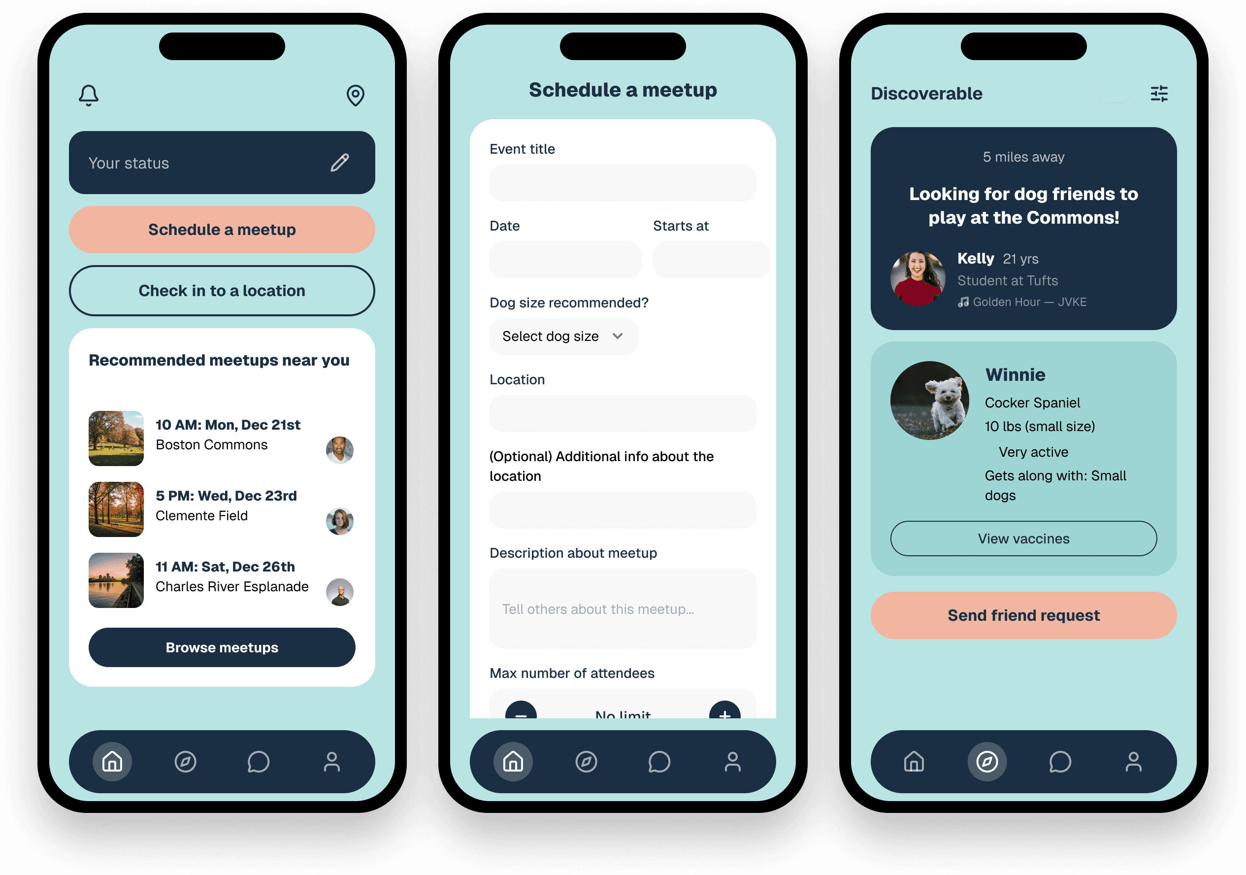
Imported Figma layers from the live v0 prototype: structured, named, and editable.
Imported Figma layers from the live v0 prototype: structured, named, and editable.
Best for: Design-developer collaboration workflows where AI-generated code needs to re-enter the design phase. Strongest when used after v0 or Lovable to create a component library from real code.
Not for: Solo design work. The value is in the team workflow, not the individual output.
Best for: Design-developer collaboration workflows where AI-generated code needs to re-enter the design phase. Strongest when used after v0 or Lovable to create a component library from real code.
Not for: Solo design work. The value is in the team workflow, not the individual output.
TOOL 10: PAPER + CURSOR · WHEN DESIGN AND CODE ARE THE SAME THING, HANDOFF BECOMES A NON-ISSUE
TOOL 10: PAPER + CURSOR · WHEN DESIGN AND CODE ARE THE SAME THING, HANDOFF BECOMES A NON-ISSUE
Paper is a code-native design canvas. Every element you place is simultaneously real HTML and CSS. There is no handoff step because design and code are the same thing. I connected Paper's MCP server through Cursor and designed 2 brand new screens: the Compatibility Score Detail view and the Post-Meetup Rating screen. Both features never existed in the original prototype, and both addressed the trust and safety gap identified in the discovery phase.
What it got right: what you design visually is actual code. There is no handoff because there is nothing to hand off. For teams moving fast where the designer and developer are close, or the same person, this eliminates an entire step.
What it got wrong: not for solo design work where the designer and developer are different people with different tools. The value is in eliminating the gap between them, which only exists if they're working in the same environment.
Paper is a code-native design canvas. Every element you place is simultaneously real HTML and CSS. There is no handoff step because design and code are the same thing. I connected Paper's MCP server through Cursor and designed 2 brand new screens: the Compatibility Score Detail view and the Post-Meetup Rating screen. Both features never existed in the original prototype, and both addressed the trust and safety gap identified in the discovery phase.
What it got right: what you design visually is actual code. There is no handoff because there is nothing to hand off. For teams moving fast where the designer and developer are close, or the same person, this eliminates an entire step.
What it got wrong: not for solo design work where the designer and developer are different people with different tools. The value is in eliminating the gap between them, which only exists if they're working in the same environment.

Left: Compatibility Score Detail, explains why two dogs are an 87% match across 4 factors.
Right: Post-Meetup Rating, star rating, selectable tags, optional note. Both designed in Paper's code-native canvas.
Left: Compatibility Score Detail, explains why two dogs are an 87% match across 4 factors.
Right: Post-Meetup Rating, star rating, selectable tags, optional note. Both designed in Paper's code-native canvas.
Best for: Small teams moving fast where the designer and developer are close, or the same person.
Not for: Solo design work, large team workflows with separate design and development streams.
Best for: Small teams moving fast where the designer and developer are close, or the same person.
Not for: Solo design work, large team workflows with separate design and development streams.
Before vs after
Before vs after
Reframing the problem with fresh eyes revealed six specific gaps the original design hadn't solved. These aren't iteration changes. They're structural improvements that only became visible when the brief was interrogated rather than assumed.
Reframing the problem with fresh eyes revealed six specific gaps the original design hadn't solved. These aren't iteration changes. They're structural improvements that only became visible when the brief was interrogated rather than assumed.
Original
Original
Evolved
Evolved
Discoverable toggle, confusing, no teaser
Discoverable toggle, confusing, no teaser
Discoverable toggle, confusing, no teaser
"Meet Now" primary CTA + "Who's nearby right now" section
"Meet Now" primary CTA + "Who's nearby right now" section
"Meet Now" primary CTA +
"Who's nearby right now" section
Friend request only, too formal for spontaneous meetups
Friend request only, too formal for spontaneous meetups
Friend request only, too formal for
spontaneous meetups
"Say Hi" quick connect alongside friend request
"Say Hi" quick connect alongside friend request
"Say Hi" quick connect
alongside friend request
Size filter only on Discover
Size filter only on Discover
Size filter only on Discover
87% compatibility score + energy level matching
87% compatibility score + energy level matching
87% compatibility score +
energy level matching
Vaccination list, optional, frequently skipped
Vaccination list, optional, frequently skipped
Vaccination list, optional, frequently skipped
"Vaccines verified" auto-displayed trust badge
"Vaccines verified" auto-displayed trust badge
"Vaccines verified"
auto-displayed trust badge
No coordination after agreeing to meet
No coordination after agreeing to meet
No coordination after agreeing to meet
Live Coordination, map, status, "I'm here!"
Live Coordination, map, status, "I'm here!"
Live Coordination, map, status, "I'm here!"
No post-meetup feedback
No post-meetup feedback
No post-meetup feedback
Post-Meetup Rating, stars + "What went well?" tags
Post-Meetup Rating, stars + "What went well?" tags
Post-Meetup Rating, stars +
"What went well?" tags
What changed for me
What changed for me
I used to reach for AI tools when they seemed useful. Now I reach for them at specific moments, for specific reasons.
ChatGPT or Claude before opening any design tool. Banani for early layout exploration. Magic Patterns when the design system exists and I need components fast. Lovable when a stakeholder needs to actually click something. Figma Make when I'm evolving something that already exists. Codia when I need to bring deployed code back into Figma to edit it or build a component library. Paper when design and code need to be the same thing.
That clarity came from stress-testing every tool under the same conditions and watching exactly where each one broke down. The designers who get the most out of AI are the ones who already have strong judgment. These tools amplify what you bring to them.
AI tools don't replace designer judgment. They reveal where it matters most.
I used to reach for AI tools when they seemed useful. Now I reach for them at specific moments, for specific reasons.
ChatGPT or Claude before opening any design tool. Banani for early layout exploration. Magic Patterns when the design system exists and I need components fast. Lovable when a stakeholder needs to actually click something. Figma Make when I'm evolving something that already exists. Codia when I need to bring deployed code back into Figma to edit it or build a component library. Paper when design and code need to be the same thing.
That clarity came from stress-testing every tool under the same conditions and watching exactly where each one broke down. The designers who get the most out of AI are the ones who already have strong judgment. These tools amplify what you bring to them.
AI tools don't replace designer judgment. They reveal where it matters most.
The result
The result
After the initial test, I went back to Lovable with more detailed prompting and built a full 35-screen prototype fully navigable, with all the evolved functionality from the redesign brief. Screens that never existed in the original design. Features the original prototype never reached. Tap through it.
After the initial test, I went back to Lovable with more detailed prompting and built a full 35-screen prototype fully navigable, with all the evolved functionality from the redesign brief. Screens that never existed in the original design. Features the original prototype never reached. Tap through it.

Rebuilding a Learning Platform From the Ground Up
Rebuilding a Learning Platform From the Ground Up
Rebuilding a Learning Platform From the Ground Up
Web
A fragmented learning platform used by thousands. No coherent system, no clear path through it. I redesigned the entire experience in 3 months as the sole designer. The work…
A fragmented learning platform used by thousands. No coherent system, no clear path through it. I redesigned the entire experience in 3 months as the sole designer. The work…
10 AI Design Tools, One App, One Week: What Actually Works
10 AI Design Tools, One App, One Week: What Actually Works
Mobile UI/UX
I wanted to know which AI design tools actually hold up under real conditions. So I built a controlled experiment: 10 tools, 3 screens each, every phase of the workflow. The answer was not what I expected.
I wanted to know which AI design tools actually hold up under real conditions. So I built a controlled experiment: 10 tools, 3 screens each, every phase of the workflow. The answer was not what I expected.