/
/
BigID
BigID · Senior Product Designer (Contract)

Engineering and the PM responded most to the structural decisions: separating the catalog from learning paths, untangling events into distinct surfaces for office hours, labs, and exams. These were problems the team had lived with for years but hadn't had a design solution for.


CONTEXT
BigID University had grown by addition, never by design. Every time a new learning surface was needed, someone bolted it on. The result was a platform that worked fine if you already knew how to use it, and was nearly impenetrable if you didn't.
CORE PROBLEMS
Discovery had no clear entry point. Continuity was missing: courses, labs, events, and learning paths lived in separate silos. Progression was invisible: learners had no way to know where they stood or what to do next.
HOW I DIAGNOSED THIS
I audited the existing platform with the director and content creator before touching any screens. The engineering team flagged the calendar and events confusion specifically — they'd heard it from learners but had no design solution for it.
PLATFORM CONSTRAINTS
BigID University is a first-party platform, not built on any LMS. That meant designing everything from scratch: onboarding, discovery, labs, exams, and certification, all within an existing product ecosystem, with legacy and new content formats coexisting, and an incremental rollout that couldn't disrupt active learners.
DESIGN IMPLICATIONS
I prioritized systemic consistency over isolated page redesigns, designed reusable patterns that could scale across content types, balanced ideal UX with engineering constraints and incremental rollout strategy, and focused on clarity and guidance rather than feature expansion.
EXPERIENCE GOALS
The priority was one thing: eliminate "what should I do next?" for first-time learners. Everything else followed from that. Progress visible early. Logged-out and logged-in states that actually connect. Courses, labs, events, and certification unified into one system instead of four separate ones.
SUCCESS CRITERIA
For learners: a clear starting point, relationships between content types that made immediate sense, and progress visible at a glance. For the platform: new content formats could be added without restructuring navigation, and engineering could reuse patterns and ship incrementally.
RESEARCH INPUTS
I looked at Salesforce Trailhead and Udemy because they solve opposite problems. Trailhead uses role-based entry points and gamified progression. Udemy is search-first with no structured paths. BigID needed something in between: structured enough for certification, flexible enough for self-directed learners. That gap became the design brief.
ITERATION IN PRACTICE
I iterated in high fidelity early because abstract wireframes wouldn't surface the real constraints. Every round was a working session with engineering, not a handoff. That's how we caught the labs entry point problem, the events calendar confusion, and the logged-out to logged-in disconnect before anything was built.
No logged-in/out distinction
Dense, no hierarchy
Siloed, no connection to learning paths
Disconnected from content
No clear eligibility or progression signal
Value prop, entry points, learning path previews
Progress, next steps, certification status
Structured by product and role
Office hours, labs, exams — distinct types
Clear eligibility, progress, next steps visible
↓ Scroll to explore the logged-out and logged-in homepages


VALUE & ORIENTATION
Orients new learners to BigID University's value and available learning formats.
OUTCOMES BEFORE COMMITMENT
Introduces learning paths and certification outcomes without requiring sign-in.
LOW-PRESSURE EXPLORATION
Encourages browsing and discovery before choosing a path.

CONTINUITY ACROSS SESSIONS
Surfaces progress, streaks, or current status immediately.
LEARNER STATE REFLECTED
Reinforces where the learner left off and what's coming up.
CLEAR NEXT STEPS
Highlights what to do next without searching.
Before: one homepage for everyone.
After: two distinct experiences that serve different learner needs without compromise.
↓ Scroll to explore


DESIGN INTENT
The catalog is organized around what a learner is trying to achieve, not where content happens to live. Every item surfaces the same information in the same order so comparison is effortless.
Before: one homepage for everyone.
After: two distinct experiences that serve different learner needs without compromise.


Before: no visibility into where you stood or what came next.
After: progress, requirements, and next steps visible at every stage.

Before: labs lived separately with no connection to courses.
After: integrated into the learning journey with clear entry and return paths

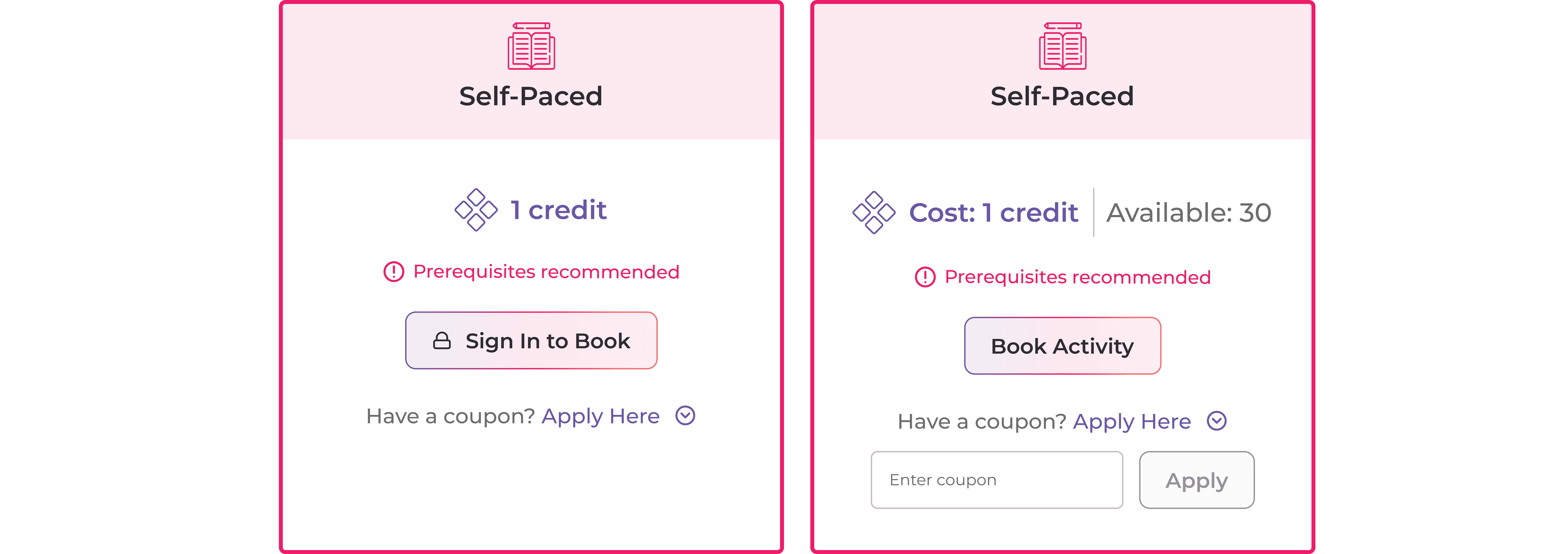


Before: four disconnected surfaces with no shared patterns.
After: one design language across 11 surfaces.


Before: surfaces that felt like different products with no shared patterns.
After: one coherent system — events, community, and profile each have distinct types so learners never feel like they've left BigID University.
The designs were presented to the full company. For a contract engagement, that doesn't happen unless the work lands.
Engineering and the PM responded most to the structural decisions: separating the catalog from learning paths, untangling events into distinct surfaces, and giving learners a clear progression signal for the first time. These were problems the team had lived with for years.
The director noted the designs were the most coherent version of BigID University the team had seen.
Shortly after the presentation, BigID underwent significant layoffs and the engineering team was let go. The platform migrated to a third-party LMS and the designs were never shipped. The work was validated. The timing wasn't right.
WHAT I WOULD HAVE MEASURED
Percentage of new learners who start their first course within one session
Catalog search-to-enrollment rate
Learning path completion rate and drop-off point by activity type
Badge and certification earn rate among learners who reach the prerequisite stage
Overall return visit rate within 30 days
REFLECTION
Three months wasn't enough time to solve personalization, and the project ended before that problem needed solving. What the foundation made possible was a platform that could have supported it without re-architecting anything. That's the right way to build, even when the build doesn't continue.
This project was designed in August 2025, before AI generation was a meaningful part of my design workflow. After it wrapped, I ran a retrospective experiment: I took the core learning journey and rebuilt it using v0 to see what a designer could ship without an engineering team — and where the gap between generated and designed actually lives.
WHAT I GAVE V0
A text description of the platform and its logic. No Figma files, no design system, no handoff. Just a description of the surfaces and what each one needed to do.
WHAT WORKED
v0 handled visual structure quickly. Navigation hierarchy, card patterns, progress states, and the self-paced versus instructor-led toggle all came through correctly on first attempt. The certification initial page with the boxed state and progress toward a badge was particularly strong.
The speed is real — compressing a week of explorations into one session is genuinely significant for low-stakes concepting.
WHERE IT BROKE DOWN
v0 struggled with stateful logic — lab management flows, task management flows, and rules-based enrollment didn't generate correctly and never fully resolved. These interactions are straightforward to design in Figma because the designer controls every state explicitly. v0 loses the thread between screens.
It also immediately defaulted to its own component library. The brand decisions that make the BigID designs feel like a real product — not a template — don't transfer from a text description alone.
THE HONEST TAKEAWAY
The gap between what v0 generates and what Figma specifies is exactly where design judgment lives. v0 can get you 60% of the way on visual structure. The 40% it can't do — stateful complexity, brand specificity, interaction logic across screens — is the part that requires a designer.
It doesn't replace the role. It raises the floor of what a solo designer can prototype quickly, which means the bar for what "a designer" delivers moves up, not away.

